tableElementElementElement functions can be customized with set and show rules.
set and show rules.A table of items.
Tables are used to arrange content in cells. Cells can contain arbitrary content, including multiple paragraphs and are specified in row-major order. For a hands-on explanation of all the ways you can use and customize tables in Typst, check out the table guide.
Because tables are just grids with different defaults for some cell
properties (notably stroke and inset), refer to the grid
documentation for more information on how to size the table tracks
and specify the cell appearance properties.
If you are unsure whether you should be using a table or a grid, consider
whether the content you are arranging semantically belongs together as a set
of related data points or similar or whether you are just want to enhance
your presentation by arranging unrelated content in a grid. In the former
case, a table is the right choice, while in the latter case, a grid is more
appropriate. Furthermore, Typst will annotate its output in the future such
that screenreaders will announce content in table as tabular while a
grid's content will be announced no different than multiple content blocks
in the document flow.
Note that, to override a particular cell's properties or apply show rules on
table cells, you can use the table.cell element. See its
documentation for more information.
Although the table and the grid share most properties, set and show
rules on one of them do not affect the other.
To give a table a caption and make it referenceable, put it into a figure.
Example
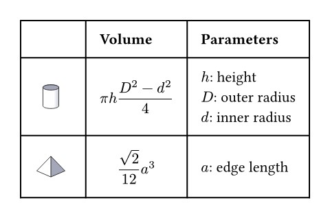
The example below demonstrates some of the most common table options.
#table(
  columns: (1fr, auto, auto),
  inset: 10pt,
  align: horizon,
  table.header(
    [], [*Volume*], [*Parameters*],
  ),
  image("cylinder.svg"),
  $ pi h (D^2 - d^2) / 4 $,
  [
    $h$: height \
    $D$: outer radius \
    $d$: inner radius
  ],
  image("tetrahedron.svg"),
  $ sqrt(2) / 12 a^3 $,
  [$a$: edge length]
)
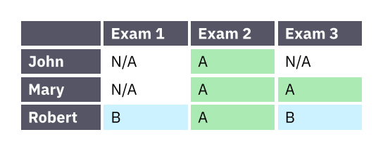
Much like with grids, you can use table.cell to customize
the appearance and the position of each cell.
#set table(
  stroke: none,
  gutter: 0.2em,
  fill: (x, y) =>
    if x == 0 or y == 0 { gray },
  inset: (right: 1.5em),
)

#show table.cell: it => {
  if it.x == 0 or it.y == 0 {
    set text(white)
    strong(it)
  } else if it.body == [] {
    // Replace empty cells with 'N/A'
    pad(..it.inset)[_N/A_]
  } else {
    it
  }
}

#let a = table.cell(
  fill: green.lighten(60%),
)[A]
#let b = table.cell(
  fill: aqua.lighten(60%),
)[B]

#table(
  columns: 4,
  [], [Exam 1], [Exam 2], [Exam 3],

  [John], [], a, [],
  [Mary], [], a, a,
  [Robert], b, a, b,
)
ParameterParameterParameters are input values for functions. Specify them in parentheses after the function name.
The gaps between rows and columns. This is a shorthand for setting
column-gutter and row-gutter to the same value. See the grid
documentation for more information on gutters.
()The gaps between columns. Takes precedence over gutter. See the
grid documentation for more information on gutters.
()The gaps between rows. Takes precedence over gutter. See the
grid documentation for more information on gutters.
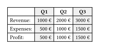
()How to fill the cells.
This can be a color or a function that returns a color. The function receives the cells' column and row indices, starting from zero. This can be used to implement striped tables.
Show example
#table(
  fill: (x, _) =>
    if calc.odd(x) { luma(240) }
    else { white },
  align: (x, y) =>
    if y == 0 { center }
    else if x == 0 { left }
    else { right },
  columns: 4,
  [], [*Q1*], [*Q2*], [*Q3*],
  [Revenue:], [1000 €], [2000 €], [3000 €],
  [Expenses:], [500 €], [1000 €], [1500 €],
  [Profit:], [500 €], [1000 €], [1500 €],
)
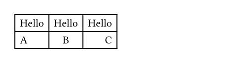
noneHow to align the cells' content.
This can either be a single alignment, an array of alignments
(corresponding to each column) or a function that returns an alignment.
The function receives the cells' column and row indices, starting from
zero. If set to auto, the outer alignment is used.
Show example
#table(
  columns: 3,
  align: (left, center, right),
  [Hello], [Hello], [Hello],
  [A], [B], [C],
)
autoHow to stroke the cells.
Strokes can be disabled by setting this to none.
If it is necessary to place lines which can cross spacing between cells
produced by the gutter option, or to override the stroke between
multiple specific cells, consider specifying one or more of
table.hline and table.vline
alongside your table cells.
See the grid documentation for more information on strokes.
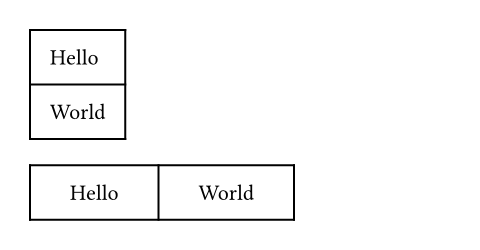
1pt + blackinsetSettableSettableSettable parameters can be set using the set rule, changing the default value used thereafter.
insetset rule, changing the default value used thereafter.How much to pad the cells' content.
Show example
#table(
  inset: 10pt,
  [Hello],
  [World],
)

#table(
  columns: 2,
  inset: (
    x: 20pt,
    y: 10pt,
  ),
  [Hello],
  [World],
)
0% + 5ptchildrenRequiredRequiredRequired parameters must be specified when calling the function.PositionalPositionalPositional parameters can be set by specifying them in order, omitting the parameter name.VariadicVariadicVariadic parameters can be specified multiple times.
childrenThe contents of the table cells, plus any extra table lines specified
with the table.hline and
table.vline elements.
DefinitionsDefinitionsThese functions and types can have related definitions. To access a definition, specify the name of the function or type, followed by the definition name separated by a period.
cellElementElementElement functions can be customized with set and show rules.
cellset and show rules.A cell in the table. Use this to position a cell manually or to apply styling. To do the latter, you can either use the function to override the properties for a particular cell, or use it in show rules to apply certain styles to multiple cells at once.
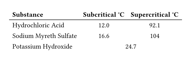
Perhaps the most important use case of table.cell is to make a cell span
multiple columns and/or rows with the colspan and rowspan fields.
Show example
#show table.cell.where(y: 0): strong
#set table(
  stroke: (x, y) => if y == 0 {
    (bottom: 0.7pt + black)
  },
  align: (x, y) => (
    if x > 0 { center }
    else { left }
  )
)

#table(
  columns: 3,
  table.header(
    [Substance],
    [Subcritical °C],
    [Supercritical °C],
  ),
  [Hydrochloric Acid],
  [12.0], [92.1],
  [Sodium Myreth Sulfate],
  [16.6], [104],
  [Potassium Hydroxide],
  table.cell(colspan: 2)[24.7],
)
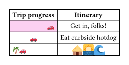
For example, you can override the fill, alignment or inset for a single cell:
// You can also import those.
#import table: cell, header

#table(
  columns: 2,
  align: center,
  header(
    [*Trip progress*],
    [*Itinerary*],
  ),
  cell(
    align: right,
    fill: fuchsia.lighten(80%),
    [🚗],
  ),
  [Get in, folks!],
  [🚗], [Eat curbside hotdog],
  cell(align: left)[🌴🚗],
  cell(
    inset: 0.06em,
    text(1.62em)[🛖🌅🌊],
  ),
)
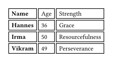
You may also apply a show rule on table.cell to style all cells at once.
Combined with selectors, this allows you to apply styles based on a cell's
position:
#show table.cell.where(x: 0): strong

#table(
  columns: 3,
  gutter: 3pt,
  [Name], [Age], [Strength],
  [Hannes], [36], [Grace],
  [Irma], [50], [Resourcefulness],
  [Vikram], [49], [Perseverance],
)
bodyRequiredRequiredRequired parameters must be specified when calling the function.PositionalPositionalPositional parameters can be set by specifying them in order, omitting the parameter name.
bodyThe cell's body.
The cell's column (zero-indexed).
Functions identically to the x field in grid.cell.
autocolspanSettableSettableSettable parameters can be set using the set rule, changing the default value used thereafter.
colspanset rule, changing the default value used thereafter.The amount of columns spanned by this cell.
1rowspanSettableSettableSettable parameters can be set using the set rule, changing the default value used thereafter.
rowspanset rule, changing the default value used thereafter.The amount of rows spanned by this cell.
1insetSettableSettableSettable parameters can be set using the set rule, changing the default value used thereafter.
insetset rule, changing the default value used thereafter.The cell's inset override.
autoWhether rows spanned by this cell can be placed in different pages.
When equal to auto, a cell spanning only fixed-size rows is
unbreakable, while a cell spanning at least one auto-sized row is
breakable.
autohlineElementElementElement functions can be customized with set and show rules.
hlineset and show rules.A horizontal line in the table.
Overrides any per-cell stroke, including stroke specified through the
table's stroke field. Can cross spacing between cells created through the
table's column-gutter option.
Use this function instead of the table's stroke field if you want to
manually place a horizontal line at a specific position in a single table.
Consider using table's stroke field or table.cell's
stroke field instead if the line you want to place is
part of all your tables' designs.
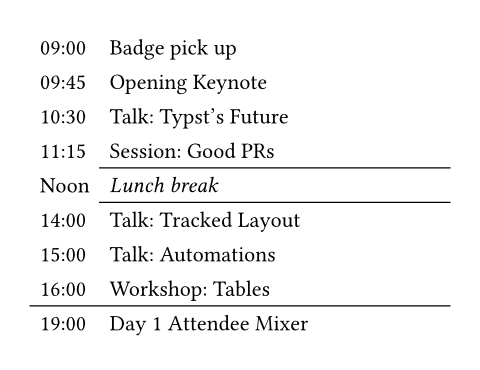
Show example
#set table.hline(stroke: .6pt)

#table(
  stroke: none,
  columns: (auto, 1fr),
  [09:00], [Badge pick up],
  [09:45], [Opening Keynote],
  [10:30], [Talk: Typst's Future],
  [11:15], [Session: Good PRs],
  table.hline(start: 1),
  [Noon], [_Lunch break_],
  table.hline(start: 1),
  [14:00], [Talk: Tracked Layout],
  [15:00], [Talk: Automations],
  [16:00], [Workshop: Tables],
  table.hline(),
  [19:00], [Day 1 Attendee Mixer],
)
The row above which the horizontal line is placed (zero-indexed).
Functions identically to the y field in grid.hline.
autostartSettableSettableSettable parameters can be set using the set rule, changing the default value used thereafter.
startset rule, changing the default value used thereafter.The column at which the horizontal line starts (zero-indexed, inclusive).
0The column before which the horizontal line ends (zero-indexed, exclusive).
noneThe line's stroke.
Specifying none removes any lines previously placed across this
line's range, including hlines or per-cell stroke below it.
1pt + blackpositionSettableSettableSettable parameters can be set using the set rule, changing the default value used thereafter.
positionset rule, changing the default value used thereafter.The position at which the line is placed, given its row (y) - either
top to draw above it or bottom to draw below it.
This setting is only relevant when row gutter is enabled (and
shouldn't be used otherwise - prefer just increasing the y field by
one instead), since then the position below a row becomes different
from the position above the next row due to the spacing between both.
topvlineElementElementElement functions can be customized with set and show rules.
vlineset and show rules.A vertical line in the table. See the docs for grid.vline
for more information regarding how to use this element's fields.
Overrides any per-cell stroke, including stroke specified through the
table's stroke field. Can cross spacing between cells created through the
table's row-gutter option.
Similar to table.hline, use this function if you want to
manually place a vertical line at a specific position in a single table and
use the table's stroke field or table.cell's
stroke field instead if the line you want to place is
part of all your tables' designs.
The column before which the horizontal line is placed (zero-indexed).
Functions identically to the x field in grid.vline.
autostartSettableSettableSettable parameters can be set using the set rule, changing the default value used thereafter.
startset rule, changing the default value used thereafter.The row at which the vertical line starts (zero-indexed, inclusive).
0The row on top of which the vertical line ends (zero-indexed, exclusive).
noneThe line's stroke.
Specifying none removes any lines previously placed across this
line's range, including vlines or per-cell stroke below it.
1pt + blackpositionSettableSettableSettable parameters can be set using the set rule, changing the default value used thereafter.
positionset rule, changing the default value used thereafter.The position at which the line is placed, given its column (x) -
either start to draw before it or end to draw after it.
The values left and right are also accepted, but discouraged as
they cause your table to be inconsistent between left-to-right and
right-to-left documents.
This setting is only relevant when column gutter is enabled (and
shouldn't be used otherwise - prefer just increasing the x field by
one instead), since then the position after a column becomes different
from the position before the next column due to the spacing between
both.
startheaderElementElementElement functions can be customized with set and show rules.
headerset and show rules.A repeatable table header.
You should wrap your tables' heading rows in this function even if you do not plan to wrap your table across pages because Typst will use this function to attach accessibility metadata to tables in the future and ensure universal access to your document.
You can use the repeat parameter to control whether your table's header
will be repeated across pages.
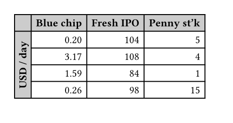
Show example
#set page(height: 11.5em)
#set table(
  fill: (x, y) =>
    if x == 0 or y == 0 {
      gray.lighten(40%)
    },
  align: right,
)

#show table.cell.where(x: 0): strong
#show table.cell.where(y: 0): strong

#table(
  columns: 4,
  table.header(
    [], [Blue chip],
    [Fresh IPO], [Penny st'k],
  ),
  table.cell(
    rowspan: 6,
    align: horizon,
    rotate(-90deg, reflow: true)[
      *USD / day*
    ],
  ),
  [0.20], [104], [5],
  [3.17], [108], [4],
  [1.59], [84],  [1],
  [0.26], [98],  [15],
  [0.01], [195], [4],
  [7.34], [57],  [2],
)
repeatSettableSettableSettable parameters can be set using the set rule, changing the default value used thereafter.
repeatset rule, changing the default value used thereafter.Whether this header should be repeated across pages.
truechildrenRequiredRequiredRequired parameters must be specified when calling the function.PositionalPositionalPositional parameters can be set by specifying them in order, omitting the parameter name.VariadicVariadicVariadic parameters can be specified multiple times.
childrenThe cells and lines within the header.
footerElementElementElement functions can be customized with set and show rules.
footerset and show rules.A repeatable table footer.
Just like the table.header element, the footer can repeat
itself on every page of the table. This is useful for improving legibility
by adding the column labels in both the header and footer of a large table,
totals, or other information that should be visible on every page.
No other table cells may be placed after the footer.
repeatSettableSettableSettable parameters can be set using the set rule, changing the default value used thereafter.
repeatset rule, changing the default value used thereafter.Whether this footer should be repeated across pages.
truechildrenRequiredRequiredRequired parameters must be specified when calling the function.PositionalPositionalPositional parameters can be set by specifying them in order, omitting the parameter name.VariadicVariadicVariadic parameters can be specified multiple times.
childrenThe cells and lines within the footer.